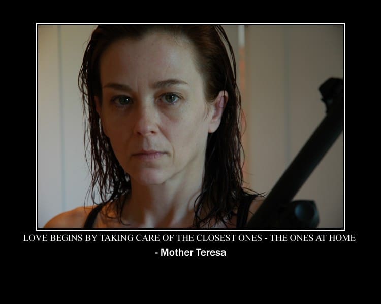
Commentator Oleg Volk challenged me to create a gun-related image that didn’t fall afoul of all the criticisms I’ve leveled against every other picture in this series. I reckon I’ve put together one that only falls afoul of the one inviolable rule of image creation: don’t use a picture that your wife doesn’t like. But, I protested, it’s meant to be raw. Anyway, here’s the photo’s genesis and my thinking . . .
First, I found the quote. I searched the usual Google suspects for “quotes about home.” I wanted text that asserted the importance of defending your home, but nothing specific to guns. If someone famous uttered it, so much the better. As soon as I found Mother Teresa take on the primacy of the family unit, I knew I was good to go.
Usurping your enemy’s words (a.k.a., “using their own words against them”) is a wikkid pissa rhetorical technique. It’s hard for someone to argue against your position when they’re busy arguing with themselves. And Mother Teresa? How can anyone argue with Mother Teresa?
The sentiment is spot on: love starts at home. And it depends on the sanctity—and safety—of the family. Hence the shotgun.
As for the image, I wanted to impart a sense of urgency. So I had Sam pose with her hair wet, as if she’d just come out of the shower (which she had). The shower is one of the places where we are most vulnerable to attack. And we know it (being naked an all). Oy! Enough of that, IF you please.
Sam is WAY pissed about the lack of makeup, but I wanted a documentary feel—in contrast to the carefully dressed and groomed models in the posters excoriated hereabouts. As she does, Sam came through with the appropriate level of aggression. I also tried to amp-up the tension by having the door slightly open behind her. HE’S BEHIND YOU!
At the same time, I wanted to play down the gun part of the program. Sam’s turned slightly away from the camera, ready to shoulder the SuperNova Pump. Rivet counters will recognize Benelli’s forend cap. No one else will. In fact, the gun is NOT the main point of the pic. Although it is. If you know what I mean.
As I’ve been banging on about focal points for a while, I put Sam’s left eye in the center of the picture. Ish. I would have jigged it around a bit to get it perfect (spoken like a true OCD), but I was working with the most basic of poster creation programs: Big Huge Labs Motivator. By the same token, I used their only typeface combo and layout. Just because I could. [Click on the image to bring it full screen and the text doesn’t look quite so crowded.]
There are things I would change (as always), but this is what I’m talking about: a powerful message, simply and coherently delivered. Yes?


The shot reminds me of Warrant Officer Ripley, ready to face the Giger alien. I always thought Sigourney Weaver looked great in that movie, so tell your wife she's in good company.
composition and lighting are amature at best.
Also, OIeg Volk has the added advantage of not being anti-gun. (or worse yet, and anti-gun person who lies about it)
Comments are closed.